AEM Components
Welcome to the part 2 of the Adobe Experience Manager learning. This is a lesson 2 – AEM Components and Inheritance.
After this session you will get understand enough
- What exactly component is?
- Basic understanding of component structure and their configuration.
- Understand when you need to create new component or you can inherit the basics from an existing components or from Out-of-the-box component.
- At the end of this session you will able to create new component by yourself.
What Exactly is a components?
Speaking about a components, the first thing you need to understand what a components is stands for in AEM. In this slide you see a list of features of a typical custom components. Let’s highlight some of them.
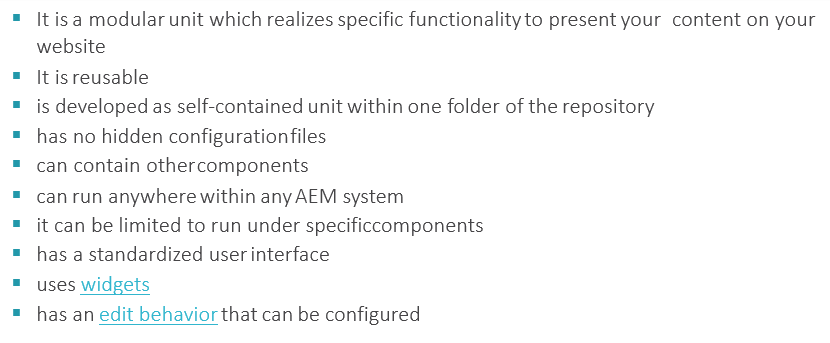
Component is a modular unit that fulfils specific functionality to display a certain content on a web site.
- It is reusable and designed to be able to contain other components.
- Component is developed as self-contained unit within one folder of the repository, they can be limited to run and posted under specific components.
- Components use widgets for building edit dialogs.
Let’s dive it deeper, so each AEM component
- has a resource type
- has a number of script that completely fulfil a business function
- often used to render the content of a resource
When the resource is a page, the component rendering it is called a Top – Level Component or a Page component.
Structure of a Component
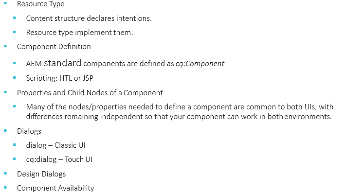
The key element of the structure is the resource type, this is an abstraction that helps to ensure that even though, the look and feel changes over time intentional remains the same.
The definition of a component can be broken as follows
AEM standard components are of a cq:Component primary type and have the key elements.
- JCR properties– as a name suggests it is a list of properties most of the time they are used to hold the content data
- Resources- They defines static element used by a component.
- Scripts- Used to implement the behaviour of the resulting instance of a component.
Most of node store properties requires to define a component, are the same for both types of AEM interface with differences remaining independent so that your component can work in both.
For eg.
- jcr:title– this is components title for eg. Used as a label when the component is listed in the components browser or side kick.
- description- description for the component can be used as mouse hover hint in the components browser or side kick.
- resourceSuperType- indicates the path of inheritance when extending a component.
Components on a Page
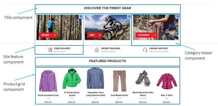
If you look at typical page in AEM, we can see that a page is assembled from blocks or set of components, as you can see on the above picture.
Page Decomposition
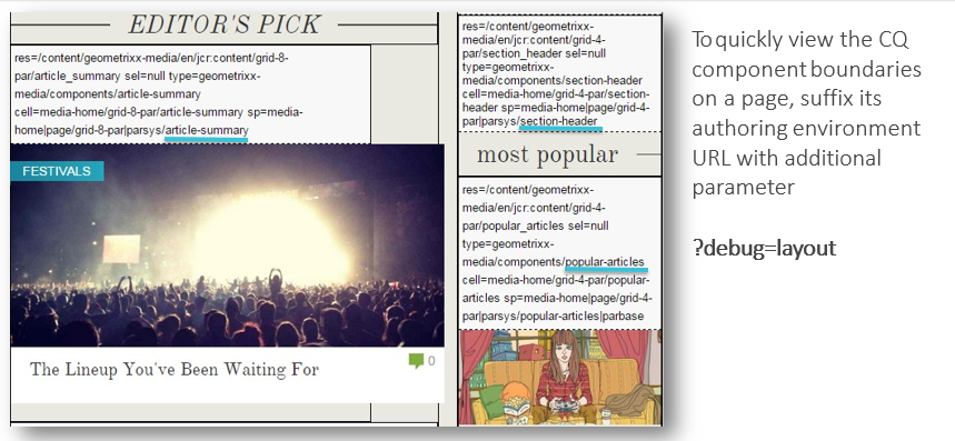
One the page is initialized with the set of components it’s difficult to understand where these component are, and which creates render this component. In-order to understand this, it is possible to use flag, ?debug=layout to get additional resource information for each component.
What it Takes to Create a Component?
There is an interesting question- Do you need to create your own component from scratch, or can you inherit the basics from an existing component?
Well,
- There is no need to reinvent the wheel
- There are several mechanisms provided by AEM to allow you to inherit and extend details from another component definition; these include override, overlay and the Sling Resource Merger.
Let’s revise which options do we have in terms of inheritance
sling:resourceSuperType: – to define parent component by hierarchy
Define necessary files under /apps folder instead of /libs – The main disadvantage of this approach that you will override out-of-the-box components for all projects on your AEM environment and can lead to the issues for multi-module environments, because requirements can be different between modules
Sling Resource Merger: The new way of inheritance in touch UI.
Sling Resource Merger: Overlay Vs Override
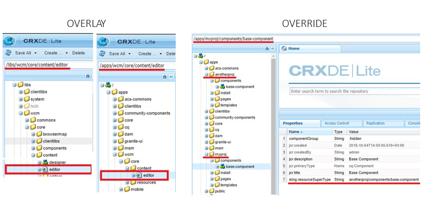
There are 2 primary features to help you- reuse and customize components in AEM.
- To overlay a resource using they configured search paths or
- To override components dialog using the resource type hierarchy.
So what does each of them mean – When you recreate a component from libs by creating exactly the same structure under apps that is called overlaying a component.
The idea is in following
- AEM has several fall-back paths when resolving relative resource type marking.
- First it looks in /apps then it goes to /libs
Eg use case – you are not satisfied with default behaviour of an out-of-the-box console and we will like to customize it.
On the other hand when you create a component and set its resourceSuperType value to another path component you inherits all its configuration parent’s html, css, js etc. implicitly used by new component- so what’s you need to do is recreates the specifically file you would like to override and implement desired behaviour that is called override.
Out-of-the-box Components
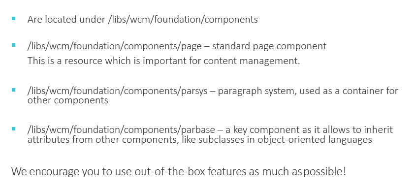
So creating custom component is necessary, because standard component cannot cover all functional requirements. Adobe provides standard components within the system they are located under /libs/wcm/foundation/components.
The most popular components from the standard lists are
- Page Component: this is a particular type of resource which is important for content management.
- Parsys: which stands for paragraph system used as container for other components.
- Parbase: this is a key components that allows components to inherit attributes from other components, similar to sub-classes in object oriented languages.
AEM Core Components and Style System
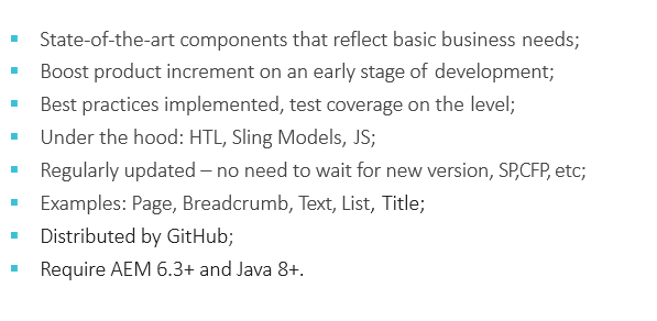
Adobe’s special hub ACS Commons provides you with number of AEM components that reflects the most common business needs, there are several points that will make you to considering using them.
Core Components: Reduce time to market with over 30 easy-to-style & production- ready components that are configurable in template.
Style System: Create visual variations of web components with zero back-end development.
Useful Links:
AEM Core Components: Need to Know Basics
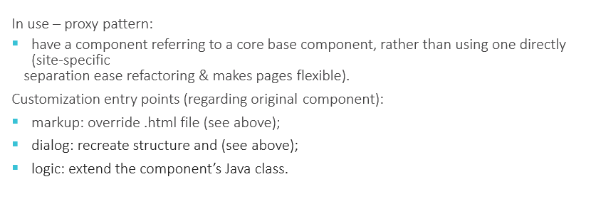
The components important feature is proxy pattern, what this pattern basically does regarding this core component making sure that your custom component refers to a base core component rather than uses it directly, because site specific separation ease refactoring and makes pages flexible.
Well that’s all for AEM Components. Hope you enjoyed this article. I would like to suggest, Kindly watch video below for practical session. In the next part we will take a look at Dialogs. Thank you!